
Building a Calendar Time Slot Picker in Salesforce
Salesforce gives you a date picker and a time field. It does not give you a grid of selectable slots. Here is what a real Salesforce time slot picker takes, and how to get one without building it.
A time slot picker is a specific interface: a calendar where you choose a day, and a grid underneath showing that day broken into bookable intervals, with the taken ones visibly unavailable. Everyone recognizes it, because every booking site on the internet uses it. Salesforce does not ship one.
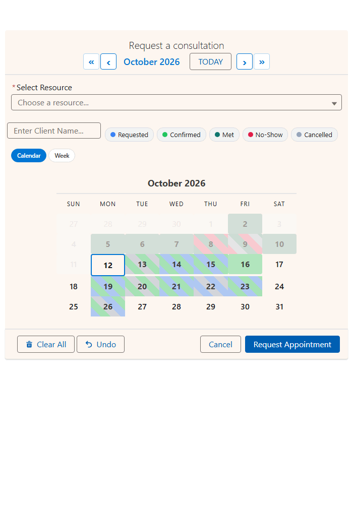
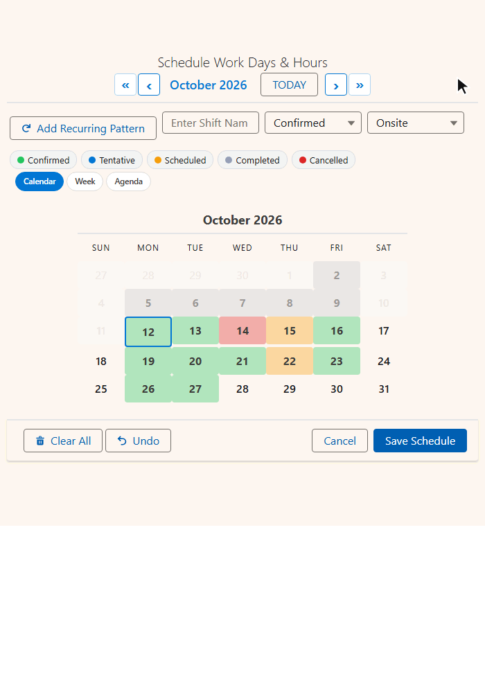
What Salesforce actually gives you
A standard Date/Time field renders as a date input plus a time dropdown. It is a form control, and it has no idea what else is booked. Nothing stops a user selecting a slot that is already gone, because the field does not know other records exist. That check happens later, in a validation rule or a flow, after the user has already committed to a choice.
That is the gap. A time slot picker queries existing records before the user chooses, and only offers what is free.
What a real slot picker has to do
| Requirement | Standard fields | With MultiDatePick |
|---|---|---|
| Divide the day into intervals | No concept of intervals | Any interval (15, 30 or 60 minutes are typical) |
| Know the working day | Any time is valid | Earliest and latest time, or business hours from each resource |
| Show what is taken | Nothing is shown | Existing bookings drawn on the grid |
| Several people per slot | Not expressible | Capacity with a live booked of capacity badge |
| Different times on different days | One field, one value | Allow Different Times Per Date |
| Stop a clash on save | Only with custom logic | Conflict Behavior: block, skip or allow |
Why building it yourself is more work than it looks
The rendering is the easy part. These are the parts nobody scopes:
Querying bookings
Efficiently, without blowing governor limits when someone opens a two-month view.
Overlap math
Fiddly the moment bookings can be different lengths.
Timezones
The running user's timezone and the record's are not always the same.
Race conditions
Two people looking at the same free slot at the same moment.
Field-level security
The component has to respect what the running user can see.
Accessibility
A grid of clickable divs is not keyboard navigable by default.
Accessibility needs the most care. A slot grid needs proper ARIA grid semantics, arrow-key navigation, and a state that is conveyed by more than color. It is the part most in-house builds skip, and the part a procurement review asks about.
Grouping slots so people can actually scan them
A 9-to-5 day at 15 minute intervals is 32 slots. Presented as a flat list, that is a wall. Grouping by period (morning, afternoon, evening) turns it into three short blocks. That helps most when the person choosing is a customer on a phone.
When you do not need the calendar at all
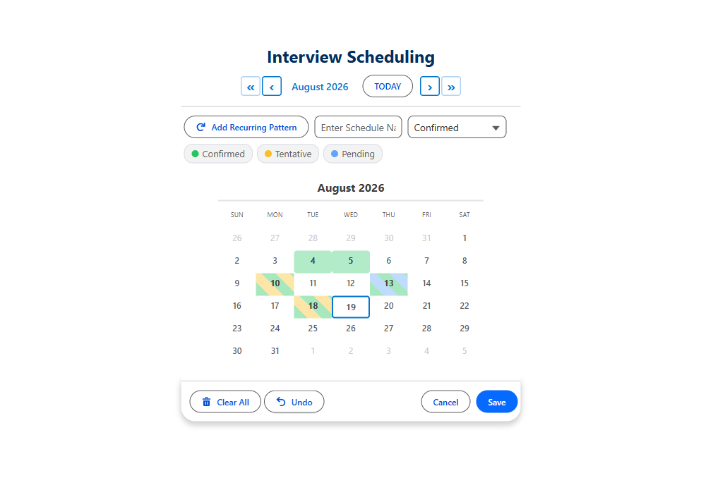
Sometimes the date is already implied. On a record page for an appointment that already has a date, a month calendar is redundant. Time Grid Only drops the calendar and shows just the slot grid for that one date, taken from a field on the host record or set directly.
The settings that make the picker
Each one is a field in the Setup Wizard. Nothing here needs code.
| Setting | What it does | API name |
|---|---|---|
| Time Slot Interval (Minutes) | The length of each slot. Any number of minutes. | timeInterval |
| Earliest Time / Latest Time | The window the grid covers on the Dates & Times component. | minTime, maxTime |
| Business Hours Start / End Field | Per-resource working hours on the Booking component. | businessHoursStartField |
| Capacity Field | How many bookings a resource holds per slot. | capacityField |
| Group Time Slots by Period | Morning, Afternoon and Evening sections. | groupTimeSlotsByPeriod |
| Conflict Behavior | Block, skip or allow a clash on save. | conflictBehavior |
| Time Grid Only | The slot grid alone, for one implied date. | timeGridOnly |
Questions people ask
What is a calendar time slot picker?
A calendar where you choose a day, with a grid underneath that splits the day into bookable intervals. Slots that are already taken are shown as unavailable, so people only pick times that are free.
Does Salesforce have a time slot picker?
Not for your own objects. A standard Date/Time field is a date input plus a time dropdown, and it cannot see other records. MultiDatePick adds a time slot picker that reads existing bookings when the calendar loads and only offers what is free.
Can the time slots be any length?
Yes. The slot interval is any number of minutes. 15, 30 or 60 minutes are typical, and a 45 minute interview slot works the same way.
Do I need Apex or a developer to add a time slot picker?
No. The Setup Wizard writes the configuration, and the component goes on a record page, app page, Experience Cloud site or Screen Flow by setting Config Name. There is no code to write.
Your Salesforce time slot picker, ready to configure
Pick an open slot in the live demo, then follow Getting Started to put one in your org.
- $20/user/month, every feature
- 30-day free trial, no card
- 100% native Salesforce
- No Apex
- Coming soon to the Salesforce AppExchange