Date
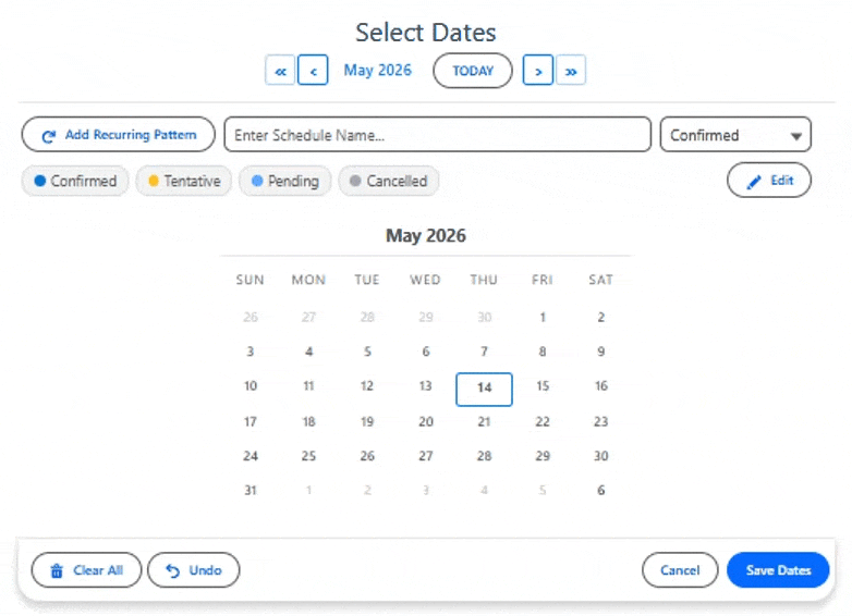
The most customizable multi-date selection component for Salesforce. Click individual dates, drag to select ranges, or generate recurring patterns with custom intervals and monthly occurrence filters. Color-code dates by status, consolidate adjacent dates into ranges, and edit existing records inline.
Overview
Date is the core date selection component in the MultiDatePick suite. It gives your users a full calendar interface where they can click individual dates, drag to select ranges, or use recurring patterns to select multiple dates at once. Recurring patterns support custom week intervals (every 1, 2, 3, or N weeks) and monthly occurrence filters (1st Monday, 2nd and 4th Friday, Last Saturday of each month).
The component works in Salesforce Screen Flows (outputting dates to Flow variables) and on Lightning Record Pages, App Pages, Home Pages, and Experience Sites (saving dates as related records automatically). Configure an endDateField to consolidate adjacent dates into single records with start and end dates — selecting Monday through Friday creates one record instead of five.
On This Page
Object & Field Mapping
When configuring this component on a Lightning Page or via the Setup Wizard, these are the object and field API names you'll need to provide.
Use Cases for Date
The Date component is ideal for any scenario where users need to select one or more dates without time slots or resource booking. Here are 15 real-world use cases.
1. PTO & Vacation Requests
Employees select their time-off dates on a calendar. Use endDateField to consolidate adjacent dates into date ranges — selecting Mon through Fri creates one record with start and end dates. Status colors show Pending (orange), Approved (green), and Denied (red) at a glance. Recurring patterns let employees block every Friday for the next quarter in two clicks.
2. On-Call Rotation
Managers assign on-call dates using recurring patterns with week intervals — set every other Monday for the next quarter in two clicks. Monthly occurrence filters (1st, 2nd, 3rd, 4th, Last) make rotation scheduling effortless. Status colors distinguish Primary (green), Backup (blue), and Swapped (orange) shifts. Preloaded dates show the current rotation.
3. Event Attendance / RSVP
Attendees RSVP to event dates by selecting them on a calendar. Each date creates one RSVP record linked to the attendee. Status colors show Registered (green), Waitlisted (orange), and Cancelled (red). preloadExistingDates shows which events the attendee has already signed up for, preventing duplicate registrations.
4. Project Milestones & Deadlines
Project managers select milestone dates, sprint boundaries, or review dates directly on a project record page. Dates are saved as related records automatically. twoMonthView helps with long-range planning. Use recordNameField to store a milestone label alongside each date.
5. Facility Blackout Dates
Facility managers mark dates when a building, campus, or venue is unavailable — holidays, maintenance windows, or special events. Other components can then reference this object via blockedDatesSourceObject to automatically grey out those dates for end users.
6. Content Publishing Calendar
Marketing teams select blog post, social media, or newsletter publication dates. Recurring patterns let them schedule "every Tuesday and Thursday" in one action. hoverFields shows the content title and status when hovering over a date. Edit mode lets them reschedule posts by moving them to new dates.
7. Field Service Multi-Day Jobs
Dispatchers assign technicians to multi-day site visits. Use endDateField so dragging Mon through Fri creates ONE job record with start and end dates — not five. Status colors mark Scheduled (blue), In Progress (orange), Completed (green), and Rescheduled (gray). preloadExistingDates shows the tech's existing assignments to prevent overlap.
8. Training & Course Enrollment
Employees pick which days of a multi-week course they'll attend. Each selection creates a session-attendance record. blockedDatesSourceObject greys out days the class isn't running. Recurring patterns help when a course meets every Tuesday for 8 weeks — two clicks selects them all.
9. Subscription & Renewal Tracking
Sales Ops teams bulk-record renewal dates across multiple Accounts or Opportunities. twoMonthView makes quarter-end planning easier. Status colors distinguish Active (green), At Risk (amber), and Expired (gray). Use defaultRecordName to auto-name each renewal record (e.g., "Q3 Renewal").
10. Audit & Compliance Schedules
Compliance officers schedule audit visits, policy reviews, or recurring inspections across the fiscal year. Recurring patterns handle "1st Monday of every month" or "every quarter end." Status colors track Scheduled (blue), Completed (green), Findings Open (amber), Closed (gray).
11. Equipment Inspection & Maintenance Dates
Facility teams mark inspection dates for assets — vehicles, HVAC, safety equipment. Place the component on each asset's record page. hoverFields shows the inspector and last-finding fields. blockedDatesSourceObject can grey out facility closure days so no inspections get scheduled then.
12. Real Estate Showing Availability
Agents publish their open-house and showing availability dates on a listing record. Status colors show Booked (orange), Open (green), and Tentative (blue). Buyers' agents can see availability before requesting a slot. Use preloadMode="readonly" on customer-facing community pages.
13. Sales Territory Visit Planning
Sales reps mark which days they're visiting which territory. Multi-day visits get consolidated via endDateField. Recurring patterns set "every other Friday in the Northeast" effortlessly. Managers see all reps' territory days at a glance from a flexipage with multiple Date components.
14. Event Venue Booking Dates
Event venues — aquariums, wedding spaces, museums, conference centers — record which dates each event runs. endDateField handles multi-day setups and tear-downs as a single record. Status colors show Confirmed (green), Tentative Hold (amber), Setup Day (blue), Tear-down (gray).
15. Recurring Task Due Dates
Replace one-off tasks with multi-date task records. Assign a contractor to "every Wednesday in October" or pick the last business day of each month for monthly reports. Each date becomes its own record with status tracking. Pairs well with Salesforce Tasks via a lookup field.
Specifications
| Supported Salesforce editions | Enterprise, Unlimited, Performance, and Developer |
|---|---|
| Salesforce API version | 63.0 |
| Supported targets | Screen Flow, Lightning Record Page, Lightning App Page, Lightning Home Page, Experience Site |
| Selection modes | Single-click dates, click-and-drag ranges, and recurring patterns |
| Recurring patterns | Weekdays, weekends, custom days, every-N-weeks intervals, and monthly occurrence filters (e.g., 1st Monday, Last Saturday) |
| Output formats | selectedDates (Text Collection of ISO dates) and selectedDateRangesJson (parsed via the MultiDatePickParser invocable Apex action) |
| Constraints & calendar | maxSelections, minDate / maxDate, allowPastDates, blocked-dates source object, two-month view, and additive-only save |
| Languages | 9 — English, Spanish, French, German, Italian, Japanese, Hindi, Brazilian Portuguese, Chinese Simplified |
| Setup | No-code Setup Wizard, Lightning App Builder, or Flow Builder |
Lightning Page Setup
What You Need First
Create a dedicated child object to store selected dates. It only needs two custom fields — a Date field and a Lookup back to the parent record. Optionally add an End Date field for date range consolidation. For example, a Trip_Date__c object with these fields:
| Field | Type | Purpose |
|---|---|---|
Date__c | Date | Stores the selected date (or start date of a range) |
End_Date__c | Date | Optional — stores the end date when adjacent dates are consolidated |
Trip__c | Lookup | Links back to the parent record |
Status__c | Picklist | Optional — for status color coding (e.g., Pending, Approved, Denied) |
recordId is passed automatically on Record Pages — you don't need to wire it manually. For App Pages, Home Pages, or Experience Sites, use the staticRecordId property to specify the parent record.Drop It In
Drag the Date component onto your page in App Builder and configure these key properties:
relatedObjectApiName— API name of your date object, e.g.Trip_Date__cdateFieldApiName— the Date field on that object, e.g.Date__crelationshipFieldApiName— the Lookup field back to the parent, e.g.Trip__cendDateField— optional End Date field for range consolidation, e.g.End_Date__cshowInline— set to ON to show the calendar directly on the page (recommended)preloadExistingDates— set to ON to show previously saved dates when the page loadssaveButtonLabel— customize the save button text, e.g. "Save Dates"
Or use the Setup Wizard and set just one property:
configName— name of a saved configuration (e.g.,PTO_Vacation_Requests). The component loads all settings from that Custom Metadata record.
What Comes Out
endDateField is configured) on the object you specified, each linked to the current record via the Lookup field. Turn on preloadExistingDates to show previously saved dates as pre-selected on the calendar. The component uses an additive save — it creates new records but does not delete existing ones.Summary View After Save
By default the calendar stays expanded after Save, taking up the same space whether the user is actively picking or just reviewing. To collapse it into a small summary card after Save (and let users click the card to re-expand), set both:
| Property | Value | Effect |
|---|---|---|
showInline | true | Renders the calendar inline on the page instead of a popup modal. |
showDoneButtonInline | true | Shows a Done button that collapses the calendar to a summary card. The card lists the selected dates and re-expands the calendar on click. |
Use this when the picker is one of several elements on a record page and you want it to step out of the way once the user has saved their picks.
Flow Setup
What You Need First
If you want the component to auto-save records, set up the same child object as the Record Page section above (Date field + Lookup). Then create a Flow variable to capture the selected dates:
| Variable Name | Type | Collection? | Notes |
|---|---|---|---|
{!selectedDates} | Text | Yes | Captures all selected dates as ISO strings |
{!dateRangesJson} | Text | No | Optional — for grouped date ranges via MultiDatePickParser |
Drop It In
Add a Screen element in Flow Builder, drag the Date component onto it, and configure:
label— button text that opens the picker, e.g. "Choose Travel Dates"modalTitle— title at the top of the calendar modal, e.g. "Pick Your Dates"showInline— set to ON to embed the calendar directly in the screenrelatedObjectApiName— your date object, e.g.Trip_Date__c(for auto-save)dateFieldApiName— the Date field, e.g.Date__cendDateField— optional End Date field, e.g.End_Date__crelationshipFieldApiName— the Lookup field, e.g.Trip__cselectedDates(Output) — wire to your{!selectedDates}Text Collection variableoutputAsJson— set to ON if you want grouped date ranges, then wireselectedDateRangesJsonto{!dateRangesJson}
What Comes Out
{!selectedDates} holds an array like ["2026-07-10", "2026-07-14"] — loop through it for additional logic. If you configured the Related Object fields, the component also auto-saves one record per date (or per range with endDateField). For grouped ranges, turn on JSON output and feed {!dateRangesJson} to the MultiDatePickParser invocable action to get loopable fromDate/toDate entries.All Properties Reference
Configuration
| Property | Type | Default | Description |
|---|---|---|---|
configName | String | — | Name of a saved Config Custom Metadata record. When set, the component loads all settings from that record — no other properties needed. |
Display Properties
| Property | Type | Default | Description |
|---|---|---|---|
label | String | Select Dates | Text shown on the button that opens the date picker. |
modalTitle | String | Select Dates | Title displayed at the top of the calendar modal. |
showInline | Boolean | false | When ON, the calendar is always visible without needing to click a button. |
twoMonthView | Boolean | false | When ON, shows two months side-by-side for wider date range visibility. |
calendarSize | String | medium | Controls calendar size: small, medium, or large. |
dayHeaderFormat | String | 3 | Day header length: 3 = SUN MON TUE, 2 = SU MO TU, 1 = S M T. |
weekStartsOnMonday | Boolean | false | When ON, the calendar week begins on Monday instead of Sunday. |
showRecurringPattern | Boolean | true | When ON, shows the "Add Recurring Pattern" button with day selection, week intervals, and monthly occurrence filters. |
showSelectedSummary | Boolean | true | When ON, displays a summary showing how many dates are selected and their date ranges. |
showDoneButtonInline | Boolean | true | When ON, shows a Done button that collapses the calendar to a summary view. |
required | Boolean | false | When ON, at least one date must be selected before the Flow can advance. |
Constraint Properties
| Property | Type | Default | Description |
|---|---|---|---|
maxSelections | Integer | 0 | Maximum dates a user can select. 0 = unlimited. |
allowPastDates | Boolean | true | When OFF, only today and future dates are selectable. |
minDate | Date | — | Earliest selectable date (YYYY-MM-DD format). |
maxDate | Date | — | Latest selectable date (YYYY-MM-DD format). |
defaultDates | String[] | — | Pre-selected dates in ISO format (YYYY-MM-DD). These dates will appear selected when the calendar opens. |
disabledDates | String[] | — | Dates that cannot be selected (shown greyed out). |
availableDates | String[] | — | Only these dates are selectable; all others are disabled. Useful for court dates, appointment slots, etc. |
autoJumpToFirstAvailable | Boolean | false | When ON with availableDates set, opens the calendar to the month of the first available date. |
Status & Visual Properties
| Property | Type | Default | Description |
|---|---|---|---|
statusField | String | — | API name of a picklist or text field on the related object. Used to color-code dates on the calendar. |
showSuccessToast | Boolean | false | Draw a success/error toast inside the component. Needed on Experience sites, where the standard Salesforce toast does not appear; also works on record pages (replaces the standard toast). |
successToastMessage | String | — | Optional custom message shown on a successful save. Leave blank to use the default message. |
statusColors | String | — | Comma-separated mapping of status values to colors, e.g. Approved:green,Pending:orange,Denied:red. Supports color names (green, blue, orange, red, gray) or hex codes. |
statusColorDisplay | String | calendar | Where to show status colors: calendar (on date cells) or grid (on time slots). For the Date component, calendar is recommended. |
hideBookingsWithStatus | String | — | Status value to hide entirely. Records with this status won't appear on the calendar. Common use: Cancelled. |
statusFieldLabel | String | — | Custom label for the status field displayed in edit mode. If blank, auto-generated from the field API name. |
secondStatusField | String | — | Optional second picklist the user chooses on save (e.g. Reason__c), alongside statusField. Use it when records need two categorizations (e.g. a lifecycle status and a reason/type). It is not color-coded — statusField owns the calendar colors. Add it to hoverFields to show it in the tooltip and edit list. Works in Flow, App Builder, and Experience sites. |
secondStatusFieldLabel | String | — | Custom label for the second picklist dropdown. If blank, auto-generated from the field API name. |
selectableSecondStatuses | String | — | Comma-separated whitelist of values the second picklist may set. Leave blank to allow all. When exactly one value is listed it is auto-applied and the picker is hidden. |
hoverFields | String | — | Comma-separated field API names shown in a tooltip when hovering over a date with existing records. E.g. Name,Status__c. |
Edit Mode Properties
| Property | Type | Default | Description |
|---|---|---|---|
enableEditMode | Boolean | true | When ON, shows an Edit Mode toggle button on the calendar. Users can click dates to select existing records for editing. |
editButtonLabel | String | — | Custom label for the Edit Mode toggle button. |
editRecordDisplay | String | name, status, time | Comma-separated keywords that set which details show for each record in the Edit Mode list, and in what order. Valid keywords: name, status, time, date, resource — rendered left-to-right in the order you list them, so date, name, status leads each row with the date. Defaults to name, status, time. time and resource only carry data in the time-based and booking components; unrecognized keywords are ignored, so use only those five. |
Record Name Properties
| Property | Type | Default | Description |
|---|---|---|---|
recordNameField | String | — | API name of a text field on the related object to store a descriptive record name. |
defaultRecordName | String | — | Default value for the record name field, e.g. "Vacation Day" or "On-Call". |
appendDateTimeToName | Boolean | true | When ON, appends the selected date to the record name. E.g. "Vacation Day — 2026-07-10". |
Output Controls
| Property | Type | Default | Description |
|---|---|---|---|
outputAsJson | Boolean | false | When ON, populates selectedDateRangesJson with consecutive dates grouped into ranges. |
Output Properties (Read-Only)
| Property | Type | Description |
|---|---|---|
selectedDates | String[] | Array of all selected dates in ISO format (YYYY-MM-DD). |
selectedDateRangesJson | String | JSON string of consecutive dates grouped into ranges with fromDate and toDate. Only populated when outputAsJson is ON. |
Record Page Click-to-Save Properties
| Property | Type | Default | Description |
|---|---|---|---|
saveButtonLabel | String | Save | Text on the save button (Record Page and Flow). |
relatedObjectApiName | String | — | API name of the object where each selected date is saved as a record. |
dateFieldApiName | String | — | API name of the Date field on the related object. |
endDateField | String | — | API name of an End Date field. When set, adjacent dates are consolidated into single records with start/end dates. |
relationshipFieldApiName | String | — | API name of the lookup field that links each record back to the parent record. |
preloadExistingDates | Boolean | false | When ON, queries existing related date records and shows them on the calendar when it loads. |
preloadMode | String | editable | editable (default) or readonly. Controls whether preloaded dates can be interacted with. |
staticRecordId | String | — | Hardcoded record ID for non-record-page surfaces (App Pages, Home Pages, Experience Sites). Replaces the auto-injected recordId. |
parentRecordIdField | String | — | Optional lookup field on the related object for alternative parent record linking. |
blockedDatesSourceObject | String | — | API name of an object to query for dates that should be blocked (shown as unavailable). |
blockedDatesDateField | String | — | Date field on the blocked dates object. |
blockedDatesFilterField | String | — | Optional lookup field on the blocked object to filter by current record. |