Date Time
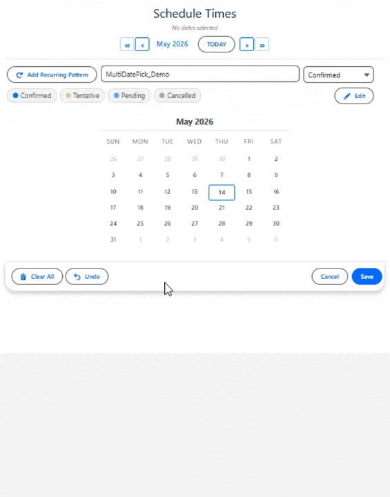
Schedule dates and times together in Salesforce. Combine multi-date selection with a visual time slot grid or dropdown pickers. Assign shared or per-date times, group slots by period (Morning, Afternoon, Evening), track statuses with color-coded slots, and detect conflicts automatically.
Overview
Date Time extends the date selection calendar with time scheduling. After selecting dates, users assign a start time (and optionally an end time) to each one using dropdown menus or a visual time slot grid. You control the time interval (any minute value; 15, 30, 60 typical), the visible time range, and whether each date can have a different time or all dates share the same time.
Use this component when your Flow or Record Page needs both a date and a time — for appointment scheduling, session booking, shift planning, interview scheduling, or any workflow where the time of day matters. All properties from the Date component are also available (recurring patterns, status colors, edit mode, date range consolidation, etc.).
On This Page
Object & Field Mapping
When configuring this component on a Lightning Page or via the Setup Wizard, these are the object and field API names you'll need to provide.
Sub-Block Use Cases
When Consolidate Time Span is enabled, gaps between selected time slots are automatically detected and saved as separate records on a child object. Users can also manually mark slots as sub-blocks.
- Shift scheduling with breaks — Employee selects 8 AM – 5 PM; the 12 – 1 PM lunch gap auto-creates a record on a Break__c object
- Travel itineraries — User blocks travel windows; layovers between flights become Travel_Leg__c records
- Training schedules — Instructor selects teaching blocks; free periods between sessions save as Available_Slot__c records
- Work schedules with appointments — Manager defines work hours; gaps for meetings or appointments auto-save to an Appointment__c object
Use Cases for Date Time
The Date Time component is ideal for any scenario where users need to select dates AND assign specific times. Here are 15 real-world use cases.
1. Interview Scheduling
Recruiters schedule interviews by selecting dates and choosing 30-minute time slots from a per-date grid. Each date gets its own grid via allowDifferentTimes, allowing different interview times on different days. Status colors track Scheduled (blue), Completed (green), No Show (red), and Cancelled (gray). appendDateTimeToName auto-names each record for easy identification.
2. Appointment Booking
Clients or service reps pick appointment dates and times from a visual time slot grid. conflictBehavior = 'block' prevents overlapping appointments by greying out taken slots. minTime and maxTime limit selections to business hours. Creates one record per appointment with date, start time, and end time fields.
3. Shift Scheduling
Managers assign employee shifts across multiple days. Pick dates and set start/end times per shift using enableEndTime. groupTimeSlotsByPeriod organizes the grid into Morning, Afternoon, and Evening sections. timeInterval = 60 provides 1-hour blocks. Auto-generates one shift record per day.
4. Maintenance Windows
IT teams schedule server maintenance windows by selecting dates and assigning 1-hour time blocks. consolidateTimeSpan groups adjacent slots into a single time span (e.g., selecting 2 AM, 3 AM, 4 AM becomes one 2–4 AM window). Conflict detection prevents overlapping maintenance on the same system.
5. Delivery Time Windows
Customers select preferred delivery dates and time windows from a dropdown picker. timeDisplayMode = 'dropdown' shows clean time pickers instead of a grid. minTime = '09:00' and maxTime = '17:00' limit to business hours. allowDifferentTimes lets each delivery date have its own window.
6. Clinic & Healthcare Appointments
Patients book clinic appointments by selecting dates and 15-minute time slots. timeInterval = 15 provides granular scheduling. statusColorDisplay = 'grid' shows which slots are Booked vs. Available at a glance. preloadExistingDates shows the patient's existing appointments on the calendar.
7. Call Center Callback Scheduling
Support reps schedule customer callbacks at specific times. timeInterval = 30 gives 30-minute slots. conflictBehavior = 'block' prevents two reps from booking the same callback slot. Each callback record gets a date, time, customer, and a callback-reason field via recordNameField.
8. Customer Onboarding Sessions
Customer Success teams schedule multi-week onboarding curricula — one 60-minute session per week for 8 weeks. Recurring patterns combined with the time grid let CSMs set the cadence in two clicks. appendDateTimeToName auto-labels each session record.
9. Training Class Time Slots
Training coordinators schedule multi-day classes with specific times each day. Use allowDifferentTimes to set different morning/afternoon blocks per day. consolidateTimeSpan with sub-blocks groups the morning + afternoon into a single training-day record while preserving lunch breaks as sub-blocks.
10. Demo Request Slot Picker
Embed in your community / public site so prospects book a demo slot themselves. preloadMode = 'readonly' shows your reps' existing demos as greyed out. conflictBehavior = 'block' prevents double-booking. maxTime caps slot pickup at business hours.
11. Quarterly Business Review (QBR) Scheduling
CSMs schedule QBRs with dozens of accounts each quarter. The time grid lets them slot in 90-minute reviews. twoMonthView spans the quarter end. Status colors track Scheduled, Confirmed by Customer, Held, and Rescheduled.
12. Open House & Property Showing Tours
Real estate listings expose available showing slots to buyers' agents. timeDisplayMode = 'grid' shows 30-minute tour blocks. statusColorDisplay = 'grid' colors slots as Available (green), Booked (orange), or Hold (amber). Embed on listing record pages or community sites.
13. Service Truck Dispatch Windows
Dispatchers slot field jobs into time windows (e.g., 8-10 AM, 10-12 PM). timeInterval = 120 creates 2-hour blocks. enableEndTime lets dispatchers extend a job past its slot when needed. Pair with a status color for In Progress to track jobs that ran over.
14. Webinar Registration
Multi-session webinar series — pick which sessions to attend. timeDisplayMode = 'dropdown' shows each session's time as a dropdown picker. conflictBehavior = 'allow' lets attendees register for overlapping sessions if they choose. Auto-generates one registration record per session.
15. Multi-Day Conference Session Picker
Conference attendees pick which sessions they'll attend across a multi-day agenda. Combine with sub-blocks: each day's keynote + breakouts becomes a parent record with sub-block detail per session. Status colors mark Confirmed vs. Tentative attendance. Use groupTimeSlotsByPeriod to organize Morning / Afternoon / Evening blocks.
Specifications
| Supported Salesforce editions | Enterprise, Unlimited, Performance, and Developer |
|---|---|
| Salesforce API version | 63.0 |
| Supported targets | Screen Flow, Lightning Record Page, App Page, Home Page, Experience Site |
| Time-slot intervals | Configurable — any minute interval (15 / 30 / 60 typical) |
| Time selection modes | Shared time across dates, or per-date times (allowDifferentTimes) |
| Time display modes | Visual grid (click slots) or dropdown pickers; groupTimeSlotsByPeriod organizes Morning / Afternoon / Evening |
| Time Grid Only mode | timeGridOnly hides the calendar and shows just the time grid for a single implied date (from timeGridDate, timeGridDateField, or today) |
| Conflict detection | conflictBehavior: block, skip, or allow; configurable look-ahead window |
| Output formats | selectedDates (Text Collection) and selectedDatesWithTimesJson (parsed via MultiDatePickParser invocable Apex) |
| Languages | 9 — English, Spanish, French, German, Italian, Japanese, Hindi, Brazilian Portuguese, Chinese Simplified |
| Setup | No-code Setup Wizard, Lightning App Builder, or Flow Builder |
Lightning Page Setup
What You Need First
Create a child object to store date+time entries. It needs a Date field, one or two Time fields, and a Lookup back to the parent. For example, an Appointment__c object:
| Field | Type | Purpose |
|---|---|---|
Appointment_Date__c | Date | Stores the selected date |
Start_Time__c | Time | Stores the start time |
End_Time__c | Time | Stores the end time (optional) |
End_Date__c | Date | Optional — for date range consolidation |
Contact__c | Lookup | Links back to the parent record |
Status__c | Picklist | Optional — for status color coding |
recordId is passed automatically on Record Pages. For App Pages, Home Pages, or Experience Sites, use staticRecordId.Drop It In
Drag the Date Time component onto your page in App Builder and configure:
relatedObjectApiName— your date/time object, e.g.Appointment__cdateFieldApiName— the Date field, e.g.Appointment_Date__crelationshipFieldApiName— the Lookup field, e.g.Contact__cstartTimeField— the Start Time field, e.g.Start_Time__cendTimeField— the End Time field, e.g.End_Time__cenableEndTime— set to ON to show both Start and End Time pickerstimeDisplayMode—gridfor visual time slot grid,dropdownfor time pickerstimeInterval— slot size: any minute value (15/30/60 typical)
Or use the Setup Wizard:
configName— loads all settings from a saved configuration, e.g.Interview_Scheduling
What Comes Out
Summary View After Save
By default the calendar and time grid stay expanded after Save. To collapse them into a small summary card (and let the user click the card to re-expand), set both:
| Property | Value | Effect |
|---|---|---|
showInline | true | Renders the picker inline on the page instead of a popup modal. |
showDoneButtonInline | true | Shows a Done button that collapses the picker to a summary card listing the selected dates and times. Click the card to re-expand. |
Useful on busy record pages where the picker should step out of the way after the user has saved their picks.
Flow Setup
What You Need First
Same object setup as Record Page above. Then create Flow variables based on your use case:
| Variable Name | Type | Collection? | Notes |
|---|---|---|---|
{!selectedDates} | Text | Yes | Dates only (no time info) — use if you just need the dates |
{!dateTimesJson} | Text | No | Dates + times as JSON — feed to MultiDatePickParser for loopable entries |
Drop It In
Add a Screen element in Flow Builder, drag the Date Time component onto it, and configure:
label— button text, e.g. "Schedule Appointments"modalTitle— calendar modal title, e.g. "Pick Dates & Times"showInline— ON to embed the calendar directlytimeDisplayMode—gridordropdowntimeInterval— any minute value (15/30/60 typical)enableEndTime— ON to capture both start and end timesselectedDatesWithTimesJson(Output) — wire to{!dateTimesJson}
What Comes Out
{!selectedDates} gives you a simple array of dates. For dates with times, feed {!dateTimesJson} to the MultiDatePickParser invocable action — it returns loopable entries with fromDate, toDate, startTime, and endTime fields. If you configured the Related Object fields, records are auto-saved with time data.All Properties Reference
Configuration
| Property | Type | Default | Description |
|---|---|---|---|
configName | String | — | Name of a saved Config Custom Metadata record. Loads all settings from that record. |
Display Properties
Shared display properties (inherited from the base, also documented on the Date page):
| Property | Type | Default | Description |
|---|---|---|---|
label | String | Select Dates | Text shown on the button that opens the date picker. |
modalTitle | String | Select Dates | Title displayed at the top of the calendar modal. |
showInline | Boolean | false | When ON, the calendar is always visible without needing to click a button. |
twoMonthView | Boolean | false | When ON, shows two months side-by-side for wider date range visibility. |
calendarSize | String | medium | Controls calendar size: small, medium, or large. |
dayHeaderFormat | String | 3 | Day header length: 3 = SUN MON TUE, 2 = SU MO TU, 1 = S M T. |
weekStartsOnMonday | Boolean | false | When ON, the calendar week begins on Monday instead of Sunday. |
showRecurringPattern | Boolean | true | When ON, shows the "Add Recurring Pattern" button with day selection, week intervals, and monthly occurrence filters. |
showSelectedSummary | Boolean | true | When ON, displays a summary showing how many dates are selected and their date ranges. |
showDoneButtonInline | Boolean | true | When ON, shows a Done button that collapses the calendar to a summary view. |
required | Boolean | false | When ON, at least one date must be selected before the Flow can advance. |
Time Selection Properties
| Property | Type | Default | Description |
|---|---|---|---|
timeInterval | Integer | 30 | Minutes between time slots (any integer; 15, 30, 60 typical). |
minTime | String | 08:00 | Earliest time in 24-hour format (HH:mm), e.g. 08:00. |
maxTime | String | 18:00 | Latest time in 24-hour format (HH:mm), e.g. 17:00. |
timeDisplayMode | String | grid | grid — visual time slot grid where users click slots. dropdown — time picker dropdowns for start/end time. |
allowDifferentTimes | Boolean | false | When ON, each selected date gets its own time picker/grid instead of sharing one time across all dates. |
enableEndTime | Boolean | false | When ON, shows a separate End Time alongside Start Time (dropdown mode) or auto-calculates end time from slot duration (grid mode). |
groupTimeSlotsByPeriod | Boolean | false | When ON, groups the time slot grid into Morning, Afternoon, and Evening sections. |
startTimeField | String | — | API name of the Time field for start time on the related object. |
endTimeField | String | — | API name of the Time field for end time on the related object. |
Time Grid Only Mode
When the host record already implies the date, you can hide the calendar entirely and show only the time-slot grid for that single implied date. Users pick their slots and the records auto-save to the host record (the same record-page click-to-save behavior). Use it on a record that is a specific day — for example an Event or Day record, or a record whose date lives in a field.
| Property | Type | Default | Description |
|---|---|---|---|
timeGridOnly | Boolean | false | When ON, the calendar is hidden and only the time-slot grid is shown, for a single implied date. The user picks slots and records save to the host record. |
timeGridDate | String | — | Optional explicit ISO date (YYYY-MM-DD) to use as the implied date for the grid. |
timeGridDateField | String | — | Optional API name of a Date field on the host record to read the implied date from. |
Implied-date priority: timeGridDate (explicit) → timeGridDateField (host-record field) → today (fallback). Configurable via the Setup Wizard (Step 3), Lightning App Builder, or Flow.
Conflict Detection
| Property | Type | Default | Description |
|---|---|---|---|
conflictLookAheadDays | Integer | 360 | Days ahead to scan for time-slot conflicts against existing records. One setting; reduce for performance on high-volume objects. |
conflictBehavior | String | block | block (default) — conflicting slots are greyed out and unclickable. skip — for batch / multi-date selection: the user picks many dates/slots at once and the component saves the open ones, silently skipping (and reporting) the ones already taken — best for "grab whatever's still open" across many dates. (For a single date, block already prevents picking a taken slot, so skip's value is the multi-date batch case.) allow — no conflict checking; overlap permitted. |
Consolidated Time Span
| Property | Type | Default | Description |
|---|---|---|---|
consolidateTimeSpan | Boolean | false | When ON, adjacent selected time slots are merged into a single record with one start time and one end time. |
Status & Visual Properties
| Property | Type | Default | Description |
|---|---|---|---|
statusField | String | — | API name of a status field on the related object for color coding. |
showSuccessToast | Boolean | false | Draw a success/error toast inside the component. Needed on Experience sites, where the standard Salesforce toast does not appear; also works on record pages (replaces the standard toast). |
successToastMessage | String | — | Optional custom message shown on a successful save. Leave blank to use the default message. |
allowWholeDayNoTimes | Boolean | false | A date selected with no time slots saves as a whole-day record (blocks or books the entire day). Dates where you pick slots still save as timed records. |
statusColors | String | — | Comma-separated mapping: Confirmed:green,Pending:orange,Cancelled:red. |
statusColorDisplay | String | both | Where to show status colors: grid (time slots only), calendar (date cells only), or both. |
hideBookingsWithStatus | String | — | Records with this status are hidden from the grid entirely. |
statusFieldLabel | String | — | Custom display label for the status field in edit mode. |
secondStatusField | String | — | Optional second picklist the user chooses on save (e.g. Reason__c), alongside statusField. Use it when records need two categorizations (e.g. a lifecycle status and a reason/type). It is not color-coded — statusField owns the calendar colors. Add it to hoverFields to show it in the tooltip and edit list. Works in Flow, App Builder, and Experience sites. |
secondStatusFieldLabel | String | — | Custom label for the second picklist dropdown. If blank, auto-generated from the field API name. |
selectableSecondStatuses | String | — | Comma-separated whitelist of values the second picklist may set. Leave blank to allow all. When exactly one value is listed it is auto-applied and the picker is hidden. |
hoverFields | String | — | Comma-separated field API names for tooltip on hover. |
Edit Mode Properties
| Property | Type | Default | Description |
|---|---|---|---|
enableEditMode | Boolean | true | When ON, shows an Edit Mode toggle for managing existing records inline. |
editButtonLabel | String | — | Custom label for the Edit Mode toggle button. |
editRecordDisplay | String | name, status, time | Comma-separated keywords that set which details show for each record in the Edit Mode list, and in what order. Valid keywords: name, status, time, date, resource — rendered left-to-right in the order you list them, so time, name, status leads each row with the time. Defaults to name, status, time. resource only carries data in the Booking component; unrecognized keywords are ignored, so use only those five. |
Constraint Properties
All constraint properties from Date are available: maxSelections, allowPastDates, minDate, maxDate, defaultDates, disabledDates, availableDates, autoJumpToFirstAvailable.
Record Name Properties
All from Dates: recordNameField, defaultRecordName, appendDateTimeToName.
Output Properties (Read-Only)
| Property | Type | Description |
|---|---|---|
selectedDates | String[] | Array of selected dates in ISO format, without time. |
selectedDatesWithTimesJson | String | JSON string with each date and its selected time(s). Feed to MultiDatePickParser for loopable entries. |
selectedDateRangesJson | String | JSON of consecutive dates grouped into ranges. Only when outputAsJson is ON. |
Record Page Click-to-Save Properties
All auto-save properties from Date are available: saveButtonLabel, relatedObjectApiName, dateFieldApiName, endDateField, relationshipFieldApiName, preloadExistingDates, preloadMode, staticRecordId, parentRecordIdField, blockedDatesSourceObject, blockedDatesDateField, blockedDatesFilterField.